
CATEGORY LIST

PRODUCT DETAILS
Price: $16.99
Rating:
Author: DWBooster
Web: www.DWBooster.com
Web: www.DWBooster.com
ADD TO CART AND CONTINUE:
PURCHASE & DOWNLOAD:
Preferred payment method:

Keypad widget
Keypad extension allows attaching a popup keypad to text, password and textarea fields for mouse-driven data input.
The keypad widget assists the user in entering special characters or characters in other languages that don't appear in standard keyboards by default. Users can select the characters that don't appear in the keyboard using the keypad widget whilst continuing typing others characters in their normal keyboards.
It also can be attached to a password field to add more secure text entry so that users don't have to use the keyboard to type their passwords or sensitive information.
FEATURES
Keypad Widget Dreamweaver Extension offers the following features:
- Allows attaching a keypad widget to forms text fields, password fields, and text areas.
- The widget can be attached to existing form fields in previously designed forms, so is not required to create new fields.
- Several widget options can be customized on insertion, or edited later using Dreamweaver Property Inspector. Configuration options allow controlling keypad layout, the characters that the keypad includes additional buttons, activation options, etc...
On the user side, the Keypad widget offers these useful features:
- Works with input text fields, password fields, and text areas.
- Assist the user in entering unusual characters or characters in other languages that don't appear in standard keyboards.
- Users don't have to user their keyboards to type sensitive or confidential information, providing extra level of security to your users when collecting this kind of information in web forms.
- Assist the user in entering any kind of symbols or weird characters, mathematical symbols, currencies, etc...
- The keypad popup is activated either by focusing the field or by clicking a button near to it.
- Text fields remain functional so that if users don't want to use the keypad widget they can use the keyboard as always.
- Any other feature or behavior added to text fields by other extensions, for example, a validation widget; remain functional as well because the keypad widget does not interfere with them.
Take a look to other features in the demo page.
REQUIREMENTS
- Adobe Dreamweaver CS3 and later versions: Adobe Dreamweaver CS4, Adobe Dreamweaver CS5, Adobe Dreamweaver CS6, ....
- The extension uses the new advanced features added to Dreamweaver CS3, so it does not work with older versions of Dreamweaver.
INSTALLATION AND USE
Extension installation
To install Keypad Widget Extension, just execute the file DWB_Keypad.mxp that you receive, or use the Adobe Extension Manager software that comes with your Dreamweaver version.
Once the extension is installed, is required to restart Dreamweaver.
The extension adds an object to the Insert Bar and to the Insert menu of your Dreamweaver installation. The Keypad widget is added to the Forms category.

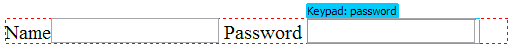
Applying the Keypad widget to form fields
To apply the Keypad Widget to a form field, password field, or text area follow this steps:
- Select a text field, password field, or text area field in the design view of the document.
- With the field selected, go to Insert > Forms > Keypad Widget in the Insert Bar or Insert Menu.
- Configure the widget options provided in the insertion dialog.
The extension generates some assets that you must upload to your live website.
Specifying Keypad widget Options
The extension allows configuring the widget with several options:
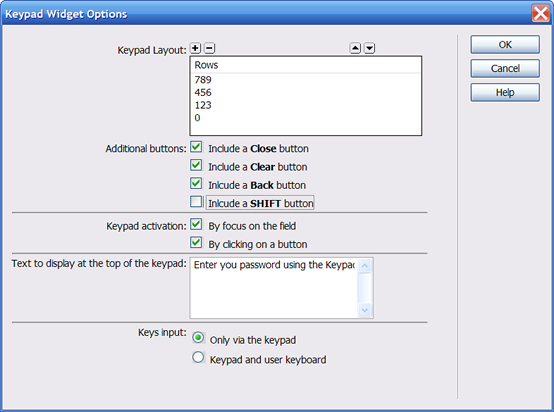
| Option | Description |
| Keypad Layout |
Specify the layout of the keypad. Enter for each row the characters that are available in the keypad. For example, to configure a numeric keypad you should specify the characters 789 in the first row, 456 in the second row, 123 in the third row and finally the 0 in the last row. You can add as many rows as you need for a specific keypad layout. |
| Additional buttons |
You can specify which additional buttons to include in the keypad: |
| Keypad activation | Specify how the keypad is triggered. There are two ways to active the keypad, by focusing on the field or by clicking on a button that is rendered near the field. |
| Text to display at the top of the keypad | Text to display at the top of the keypad. Include some help or instructions to the user. |
| Keys input | Specify how the characters are entered. Only via the keypad: Text entry only via the the keypad, keyboard disabled. Keypad and user keyboard: Allow text from the keypad and the keyboard too. |
Editing widget options with property inspector
The property inspector enables you to make edits to the Keypad widget.
To alter the options for the widget, follow these steps:
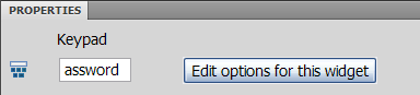
- Select the widget in the document by clicking in the outline label.
- In the Property inspector (Window > Properties) you will see the editing options for the widget.
- Click the button Edit options for this widget
- The widget options dialog that enables to specify the configurations options will be open.
- Edit the options.
- Click OK button.
After clicking OK button, some code will be updated; make sure to save the changes and to upload all modified resources to the live website.
SCREEN SHOTS
;)
;)
;)
- click image to enlarge -


